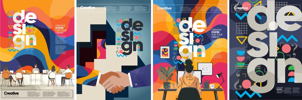
What are the 7 Rules of Graphic Design?
Graphic design is not just about making things look good; it’s about effective communication through visual elements. Whether you’re a seasoned designer or just starting, understanding and applying the fundamental rules of graphic design is crucial to creating compelling and professional work. In this post, we’ll explore the seven essential rules of graphic design that every designer should follow.
1. Balance: Achieving Visual Stability
Symmetry vs. Asymmetry
Balance is the foundation of any design. It refers to the distribution of visual elements in a way that creates a sense of equilibrium. There are two main types of balance: symmetrical and asymmetrical. Symmetrical balance involves mirroring elements on either side of a central axis, creating a formal and organized look. Asymmetrical balance, on the other hand, uses differing elements that still achieve a balanced visual weight, leading to more dynamic and interesting designs.
External Link: For more on the importance of balance in design, check out this guide to design principles.
2. Contrast: Creating Emphasis
Using Light and Dark
Contrast is key to making your design elements stand out. By using contrasting colors, shapes, and sizes, you can create emphasis and draw attention to the most important parts of your design. Contrast is not just about color; it can also be achieved through typography, texture, and space.
Without contrast, designs can appear flat and uninteresting, making it difficult for the viewer to focus on the key elements.
3. Alignment: Ensuring Order and Organization
Keeping Elements in Harmony
Alignment ensures that all elements in your design are visually connected and in harmony with each other. Proper alignment creates a clean and organized look, which makes your design easier to navigate. Whether it’s text, images, or other graphic elements, alignment helps to create a visual connection between them.
Internal Link: To learn more about how alignment can enhance your designs, visit our contact page.

4. Repetition: Reinforcing Consistency
Building a Cohesive Design
Repetition is about using the same or similar elements throughout your design to create consistency. Whether it’s a repeated color scheme, font style, or graphic element, repetition helps to unify your design and make it more cohesive. This rule is particularly important in branding, where consistency across various platforms is key to brand recognition.
5. Proximity: Grouping Related Elements
Creating Relationships
Proximity is about grouping related elements together to create a relationship between them. By placing elements that are related close to each other, you make it easier for the viewer to understand their connection. This rule helps in organizing your design in a way that is logical and intuitive.
External Link: Discover how proximity impacts user experience in this article on design principles.
6. White Space: Embracing Empty Areas
Letting Your Design Breathe
White space, also known as negative space, is the empty space around design elements. It’s crucial for creating a clean and uncluttered look. White space allows your design to “breathe” and helps to direct the viewer’s attention to the most important elements. Don’t be afraid of empty areas; they are as important as the elements themselves.
7. Hierarchy: Guiding the Viewer’s Eye
Directing Focus
Hierarchy is about organizing elements in a way that guides the viewer’s eye through the design in a specific order. By using different sizes, colors, and placement, you can create a visual hierarchy that emphasizes the most important parts of your design. Hierarchy helps to ensure that your message is conveyed clearly and effectively.
For tips on how to create effective visual hierarchies, visit our contact page.
Conclusion
By understanding and applying these seven rules of graphic design—balance, contrast, alignment, repetition, proximity, white space, and hierarchy—you can create designs that are not only visually appealing but also effective in communicating your message. These rules serve as the foundation for great design, ensuring that your work is both professional and impactful.
For more information on how to implement these rules in your projects, contact Digitor today.
For further reading, consider exploring Smashing Magazine for design tips and trends, or visit AIGA for professional design resources and insights.
Explore more related articles to deepen your understanding and make informed choices about graphic design techniques
Why Custom Website Development is Essential for Your Brand
How to Choose the Best Graphic Design Services for Your Business


