Why Corporate Brand Fonts Matter
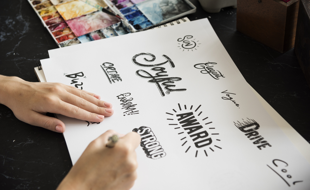
In B2B and enterprise markets, first impressions are formed in milliseconds. Corporate brand fonts do a quiet but powerful job—projecting trust, authority, and clarity before a single sentence is read. The right typography unifies your logo, website, decks, sales collateral, and product UI, turning every touchpoint into a consistent brand statement. When companies neglect typographic standards, they often struggle with inconsistent visuals, mixed messaging, and lower perceived credibility.
What Defines Corporate Brand Fonts
1) Readability & Legibility
Corporate typography must be crystal clear at any size—from email footers to tradeshow backdrops. Sans-serif workhorses (like Inter, Lato, or Source Sans) and balanced serifs (like Merriweather or Charter) excel here.
2) Timeless Design
Trendy letterforms date quickly. Corporate brand fonts lean on timeless geometry and restrained contrast so your visual identity feels relevant for years.
3) Full Family & Language Support
A robust family (weights, italics, variable axes) plus extended glyph sets ensure your documents, dashboards, and global content remain consistent.
4) Performance Across Media
From Retina screens to office printers, corporate brand fonts should render cleanly, compress well, and load fast.
Popular Categories for Corporate Brand Fonts
Sans Serif: Modern & Minimal
Clean sans serifs signal efficiency and innovation. Families like Avenir, Montserrat, and IBM Plex Sans are flexible across UI, web, and print. These are classic brand fonts for tech, SaaS, and consulting.
Humanist Sans: Friendly & Readable
Humanist shapes (e.g., Frutiger, Calibri, PT Sans) offer warmth without losing professionalism—great for customer-facing materials and intranets.
Serif: Established & Authoritative
For finance, legal, and education, balanced serifs (e.g., Georgia, Source Serif, Tiempos) add gravitas while staying readable in long-form documents.
Slab Serif: Bold & Structured
Roboto Slab or Rockwell provide confident headlines for presentations and annual reports, pairing nicely with a lighter sans serif for body copy.
Pairing Corporate Brand Fonts (H3)
-
Headline sans + body serif: Modern headline presence with classic reading comfort.
-
Serif headline + sans body: Formal headlines balanced by clear UI-friendly paragraphs.
-
One superfamily: Use a single variable family with multiple weights for ultimate consistency.
Governance: Keeping Typography Consistent
A solid type system prevents drift:
-
Style guide: Define primary/secondary corporate brand fonts, sizes, weights, tracking, and line heights.
-
Use cases: Map which font goes to decks, web, product UI, PDFs, and signage.
-
Accessibility: Ensure sufficient contrast and readable sizes to meet WCAG.
-
Licensing: Centralize licensing so teams use approved fonts everywhere.
For high-quality, India-designed options and licensing guidance, explore the Indian Type Foundry.
How to Choose Corporate Brand Fonts
-
Audit your brand voice — authoritative, approachable, or innovative? Align letterforms accordingly.
-
Test in the wild — try candidate fonts on your homepage hero, a sales one-pager, dashboard labels, and a PPT deck.
-
Check technicals — variable font availability, hinting quality, and web performance.
-
Plan for scale — will your corporate brand fonts support new markets and languages?
-
Create a fallback stack — define safe alternatives for email and legacy systems.

Digital Performance & UX Considerations (H3)
-
Variable fonts reduce requests and keep styles consistent.
-
Subsetting shrinks webfont size while preserving necessary glyphs.
-
Font loading strategies (preload,
font-display: swap) improve Core Web Vitals. -
UI clarity—choose corporate brand fonts with distinct characters (I/l/1; O/0) to reduce user error in forms and dashboards.
Real-World Rollout Plan
-
Select two families (primary + supporting).
-
Define tokens (H1–H6, body, captions, UI labels).
-
Update templates (PPT, Docs, email signatures, proposal PDFs).
-
Ship to web & product with CSS variables and design tokens.
-
Train teams and add checks to brand QA.
Need a Hand?
Choosing and implementing brand fonts can be complex—especially across web, product, and print. Our team at Digitor can audit your current typography, recommend pairings, and roll out a consistent, scalable system.
Contact us for a corporate typography kit tailored to your brand.
Explore more related articles to deepen your understanding
Best Fonts for Branding: Create a Lasting Visual Identity
SEO Content Writing: A Complete Guide for BeginnersDoes Google use Cloudflare
Content Writing Basics: A Beginner’s Guide to Effective Writing


