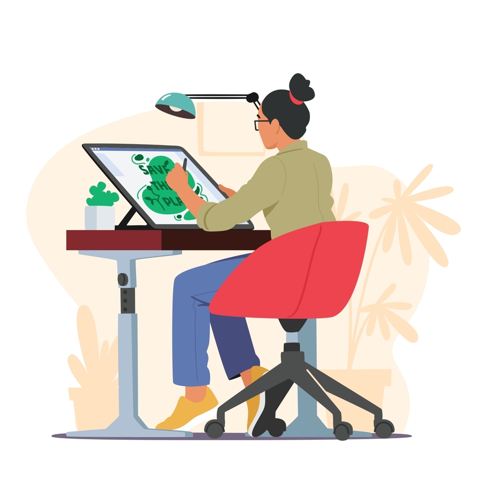
The Art of Typography Design in Graphic Design
Introduction
Typography design is a fundamental aspect of graphic design that significantly influences how a message is perceived. It’s not just about choosing a font; it’s about creating a visual language that communicates effectively and aesthetically. In this blog, we delve into the art of typography design in graphic design, exploring its importance, key principles, and how to master this craft to elevate your design projects.
The Importance of Typography in Graphic Design
What is Typography Design?
Typography design involves the selection and arrangement of type to make written language readable, legible, and visually appealing. It encompasses everything from the choice of font, point size, line spacing, and letter spacing to the overall style and layout. In graphic design, typography is used to create hierarchy, convey mood, and guide the viewer’s attention.
Why Typography Matters
Typography is more than just text on a page; it’s a powerful tool that shapes the user’s experience and influences how they interpret the content. Well-executed typography can enhance readability, establish a visual tone, and create a strong brand identity. Conversely, poor typography can confuse, distract, or even alienate the audience.

Key Principles of Effective Typography Design
1. Legibility and Readability
Legibility refers to how easy it is to distinguish individual letters, while readability pertains to how easily text can be read in context. To achieve both, designers must choose appropriate typefaces, font sizes, and line spacing. For instance, serif fonts are often used for printed text because they guide the eye along the lines, while sans-serif fonts are preferred for digital screens due to their clarity at various sizes.
2. Hierarchy and Contrast
Typography design plays a crucial role in establishing a visual hierarchy, which guides the reader through the content in order of importance. By varying font sizes, weights, and styles, designers can create contrast and draw attention to key elements such as headings, subheadings, and body text. Effective use of hierarchy ensures that the most important information stands out and is easily accessible.
3. Alignment and Spacing
Proper alignment and spacing contribute to a clean and organized layout. Consistent alignment, whether left, right, or centered, provides structure and balance to the design. Additionally, appropriate use of white space (the empty space around text and graphics) prevents overcrowding and enhances readability. Line spacing, also known as leading, should be adjusted to ensure that lines of text don’t overlap or appear too distant.
4. Typeface Selection
Choosing the right typeface is a critical decision in typography design. Different typefaces convey different moods and messages. For example, a modern sans-serif typeface might communicate simplicity and elegance, while a bold, decorative typeface might evoke creativity and playfulness. It’s essential to select a typeface that aligns with the overall tone and purpose of the design.
5. Consistency
Consistency in typography helps establish a cohesive and professional look. Using the same typefaces, font sizes, and styles throughout a design project creates a unified appearance that reinforces brand identity and readability. Inconsistent typography can create a disjointed experience that confuses the audience.
Mastering Typography in Graphic Design
1. Understanding Typography Trends
Staying updated with typography trends is essential for creating modern and relevant designs. Trends such as minimalist typefaces, bold and oversized typography, and creative letterforms can add a contemporary touch to your work. However, it’s important to use trends judiciously and ensure they align with the project’s goals.
2. Experimenting with Typography
Don’t be afraid to experiment with typography to create unique and engaging designs. Play with different typeface combinations, adjust spacing, or introduce custom typography to bring your creative vision to life. Experimentation can lead to innovative solutions that set your design apart from the rest.
3. Balancing Aesthetics and Functionality
While aesthetics are important, functionality should never be compromised. The primary purpose of typography is to convey information clearly. Ensure that your design remains functional by prioritizing legibility and readability, even as you explore creative typography solutions.
Conclusion
The art of typography design is a vital skill in graphic design, one that requires both creativity and precision. By mastering the principles of legibility, hierarchy, alignment, typeface selection, and consistency, you can create impactful designs that communicate your message effectively. Ready to elevate your graphic design projects with expert typography? Contact us to bring your vision to life.
For further reading on typography design, visit Typewolf for inspiration and resources, or explore Awwwards for award-winning typography examples.


